"Let's get a cycle time chart going" tends to turn into a small project of its own. Azure DevOps does not draw one for you out of the box, so the usual next step is connecting Power BI to the Analytics OData feed or an Analytics view, building a report, and finding somewhere to host and share it: plus a Power BI Pro seat for anyone who needs to open it. That is a perfectly good path when you already use Power BI for other reporting, or need to blend Azure DevOps data with numbers from somewhere else. It is a lot of setup, though, if all you actually wanted was to see how long your team's work takes.
What a cycle time chart actually needs
Strip it down and a useful cycle time view needs four things: a start and finish timestamp for each item, based on your team's own workflow-stage mapping (not a generic guess at what "in progress" means); a split by work type, because a bug and a multi-week feature do not belong on the same line; a sense of the spread, not just an average: a median and a higher percentile, so one very slow item cannot quietly drag the headline number around; and a way to know it is honest when the sample is small. None of that requires a general-purpose BI tool. It requires reading the work item history Azure DevOps already has and doing the same calculation, consistently, every time you open the screen.
The Cycle Time view
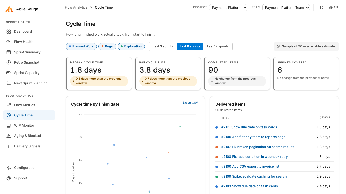
That is what Agile Gauge's Cycle Time view does: one dot per delivered item over the last six sprints, split into planned work, bugs and exploration, with median and 85th-percentile reference lines. When a bucket does not have enough delivered items to make those lines meaningful, they are not drawn at all, rather than quietly extrapolated from three data points and presented as if they meant something.
Every dot is a real work item
A scatterplot that cannot answer "which item was that?" is not much use in a real conversation. Click any dot, any row in the table beside the chart, or either percentile line, and a shared item panel opens showing exactly which work items sit behind it, including each item's actual journey through your team's mapped stages: where it sat, and for how long. The table beside the chart exists for the same reason: there is no accessible way to navigate a scatterplot by keyboard alone, so the table is not a courtesy, it is the answer to the same question the chart is drawing.
Why a median and an 85th percentile, not one average
A single average cycle time hides exactly the thing most worth knowing: how consistent the team actually is. Two teams can post the same average and be in completely different situations: one finishing almost everything in a tight band, the other finishing most items quickly and dragging a handful out for weeks. The median tells you what a typical item looks like; the 85th percentile tells you what you should plan around for the items that do not go smoothly. Neither line is drawn until there is enough delivered work in that bucket to support it: a team with three bugs delivered this window will see the dots and the table, but not a percentile line invented from three points and presented as if it were a stable measurement.
Reading the sprint, not just the dots
Above the chart, a reading strip carries the same figures with their deltas against the previous window, plus a confidence line that says out loud how much the current numbers should be trusted given the sample size behind them. Bucket and window filters narrow the view to a specific work type or a different span of sprints: switching the bucket filter to "Bugs" alone, for instance, answers "are our bugs actually faster than our features, or does it just feel that way" without anyone reaching for a spreadsheet. An Export CSV button is there for the moment someone genuinely does want to hand the raw numbers to someone else: including, if that is where you end up, a Power BI report of your own.
Where this does not replace Power BI
This view is not trying to be a general-purpose reporting tool, and it should not be one. If you need to combine Azure DevOps data with numbers from other systems, build fully custom cross-project reports, or you already have a Power BI presence your organization relies on, the native Analytics-and-Power-BI path is still the right call: that is exactly what it is built for. What Agile Gauge's Cycle Time view is for is the much more common ask: "show our own team's cycle time, right now, without anyone standing up a reporting project to get there."
Getting there
There is no OData connection to configure and no report to build before you see anything. Once your team's workflow-stage mapping is set in Configuration, a one-time step every view in the hub relies on, Cycle Time reads your last six sprints and draws the chart. If you have not touched Configuration yet, the screen tells you so rather than guessing at a mapping and showing you numbers based on a guess.
Agile Gauge reads directly from your own Azure DevOps organization: nothing is copied to a server we operate. Start a 14-day trial, full features, no card required.