"How's our flow?" is a question small teams ask themselves without always agreeing on what would answer it. In practice, four numbers cover most of it: how much finished work is coming out the other end (throughput), how long that work actually took (cycle time), how much is in flight right now (work in progress), and how long anything unfinished has already been sitting (age). None of the four tells the whole story alone, a team can have healthy throughput while quietly accumulating a pile of aging, half-started work, which is why Agile Gauge splits them across a few focused views rather than one dashboard trying to say everything at once.
Throughput: how much actually finished
Throughput, items completed over a window, shows up throughout Agile Gauge rather than living on its own screen: Sprint Summary's Delivered figure is one sprint's throughput, and Flow Health grades throughput across several teams at once, against each team's own trailing trend rather than a fixed target. On its own, throughput answers "how much," but says nothing about "how long" or "how consistent": which is where cycle time comes in.
Cycle time: the full spread, not one average
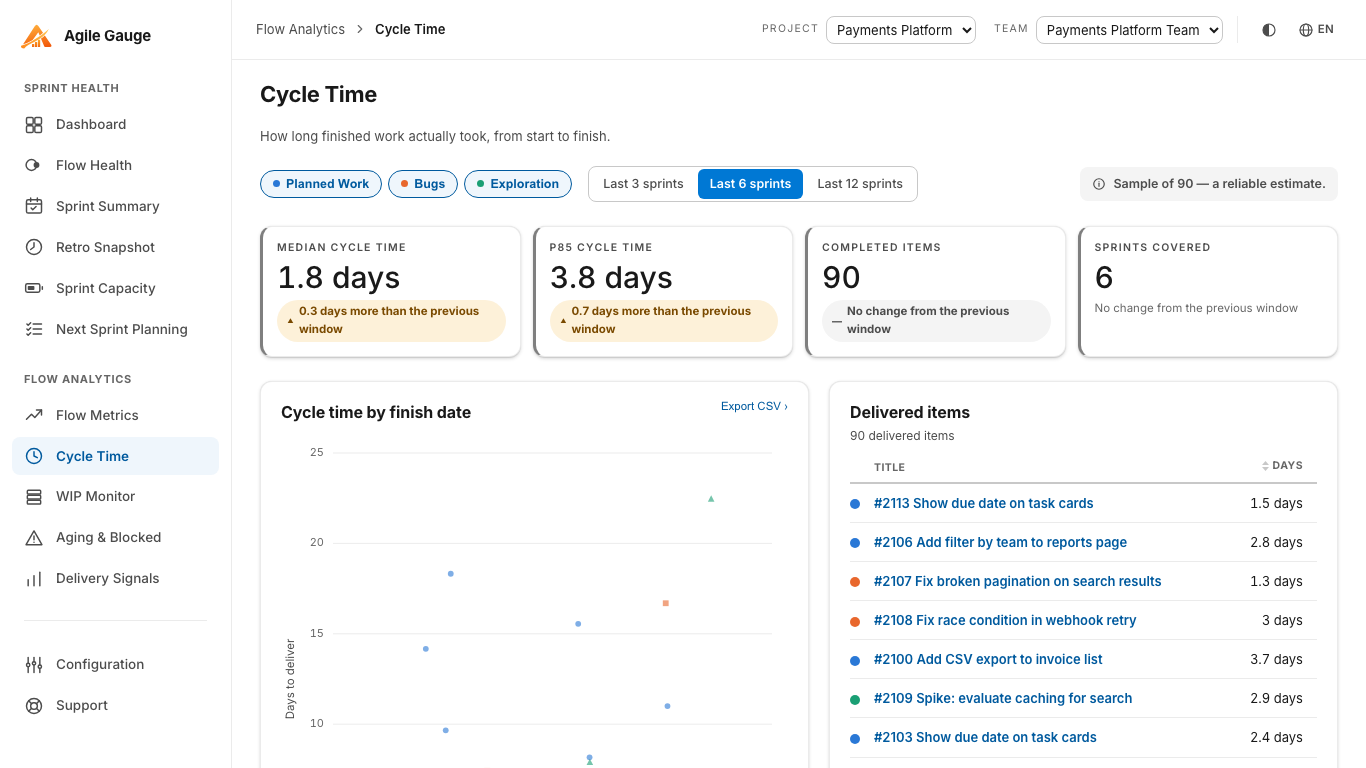
Agile Gauge's Cycle Time view plots one dot per delivered item over a rolling window of the last 3, 6, or 12 sprints, split by Planned Work, Bugs, and Exploration, with median and 85th-percentile reference lines. An item counts as complete only once its current state is mapped to Done under your workflow mapping; its start is the first time it ever moved into a state mapped as in progress, or its Activated Date if that never happened. Percentiles use nearest-rank, not interpolation, the value shown is always a day count some real item actually had, and reference lines only appear once there are at least 10 delivered items in the window, so a small sample never gets dressed up as a stable trend.
WIP: how much is in flight right now
Cycle time tells you how long finished work took; it says nothing about how much unfinished work is currently open, which is what work in progress measures. Agile Gauge's dedicated WIP Monitor view tracks a team's in-progress count against a limit set in Configuration, with Over limit, Near limit, and No limit set states, plus a trend of the last several sprints' midpoint WIP. It is a small, focused screen on purpose: a team that wants to see both "are we over our WIP limit" and "what's actually aging in there" needs the next view too.
Flow Metrics: where the time actually goes
Throughput and cycle time both describe outcomes; Agile Gauge's Flow Metrics view describes the mechanism behind them: how much of an item's total time was spent actively worked versus waiting, broken down by your team's own workflow stages (New, Queued, In Progress, Test, Review, Waiting). In Progress, Test and Review count as active time; New, Queued and Waiting count as waiting time; time before an item's real start is excluded from both. The headline flow-efficiency percentage needs at least 10 completed items with usable stage history, below that, it is withheld rather than shown as an unreliable figure, and most teams see a lower number than they expect, since it is a map of where the waiting is, not a score to defend.
Age: what's been sitting the longest
None of the three metrics above look at work that has not finished yet. Agile Gauge's Aging & Blocked view lists every unfinished item in the team's active sprint that has genuinely started, sorted blocked items first and then oldest first, with age shown as fractional calendar days from the same start point Cycle Time uses: so an item's age here and its eventual cycle time, once it finishes, are guaranteed to agree. Blocked is checked against three signals: a matching state name, a tag, or a whole-word match in the title; two further configurable signals, a custom field and a board column, exist in Configuration but are not checked on this specific view, and a warning strip says so if your organization relies on either.
Reading all four together
Each of these views answers a narrower question than "how's our flow" on its own, and that is the point: a single blended score would hide exactly the disagreement worth having, like healthy throughput sitting next to a growing pile of aging work nobody has flagged as blocked yet. Every one of them opens the same kind of item panel underneath its numbers, so a figure that looks wrong on any screen leads to the same place: the actual work items behind it, with a link straight into Azure DevOps.
Getting there
All four views share the same one-time setup: your team's workflow-stage mapping in Configuration, so Agile Gauge knows which states count as started, active, and done. WIP Monitor and Flow Metrics also read from the same work-item-type filter (Configuration → Item Types) that Sprint Summary and Aging & Blocked use, so a bug excluded from one screen is excluded consistently everywhere else too.
None of the four views above require exporting data anywhere or copying numbers into a spreadsheet to compare them: each reads live from Azure DevOps the moment it is opened, so the throughput figure on Sprint Summary, the cycle time on the Cycle Time view, and the WIP count on WIP Monitor are always looking at the same underlying history, not three exports taken on three different days.
Agile Gauge starts at $20 a month for up to 2 users. Start a 14-day free trial: full features, no card required.