Once an organization has more than one Scrum team, someone eventually wants to know how they compare: not to rank them against each other for its own sake, but to spot which team needs help and which one is quietly doing something worth copying. The usual way that question gets answered is a spreadsheet: someone opens each team's board in turn, copies out a number or two, and pastes it into a shared tab that is accurate for about as long as it takes to build it. Agile Gauge's Flow Health view is built to answer the same question by reading the numbers live instead.
A team set: one saved list, not five browser tabs
Flow Health works from a team set: a named, saved list of teams, up to 12 of them, that the view reports on together. Sets can be created, duplicated (carrying over both the teams and the goals so you can branch off a variant without starting over), renamed up to 60 characters, and deleted; deleting your last set falls back to a fresh default rather than leaving you with nothing to look at. Team sets are saved per person rather than shared across the organization, and each person can keep up to 20 of them: so a scrum master following six teams and a manager following a different eight are not fighting over one shared list.
Six report cards, not one score
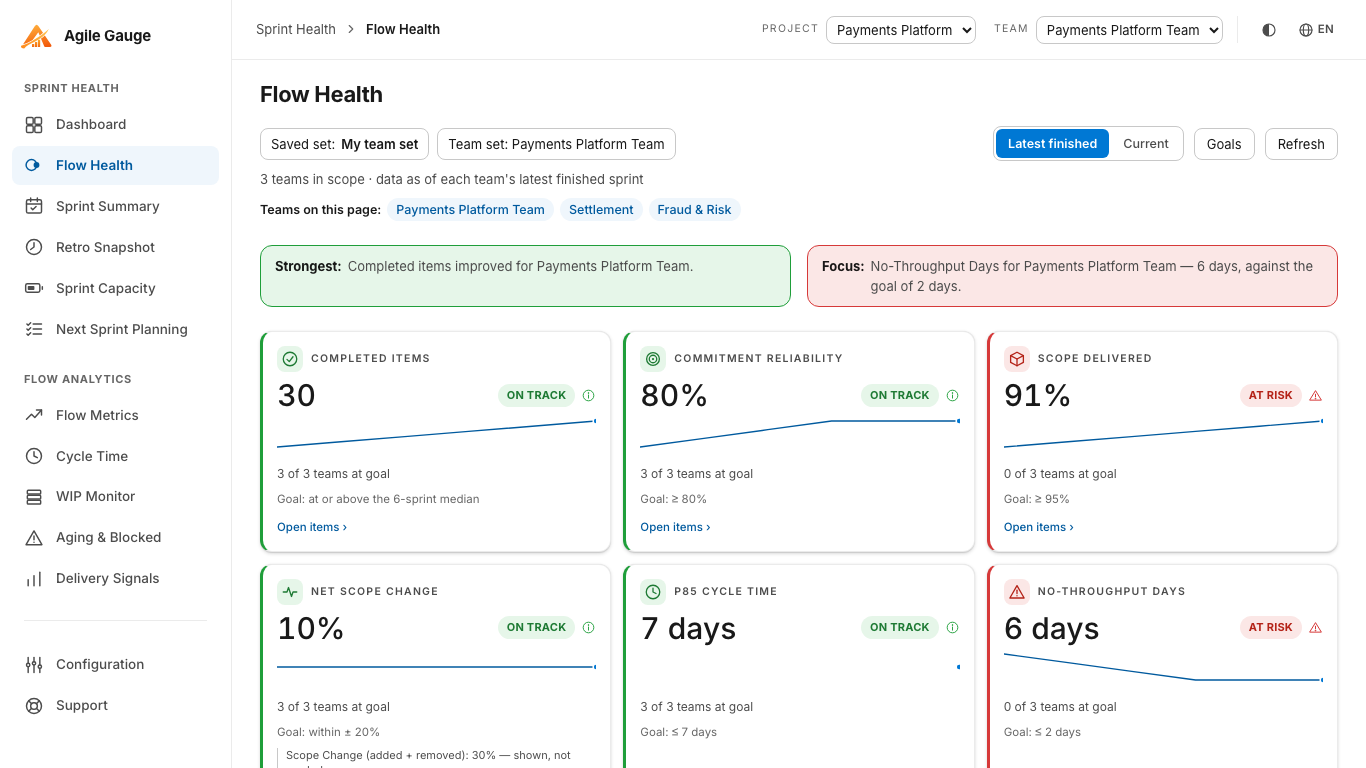
Flow Health deliberately does not roll everything into a single blended "health score." It grades six KPIs independently, Throughput, Sprint Commitment, Scope Delivered, Net Scope Change, P85 Cycle Time, and No-Throughput Days, each landing on its own status, with a sentence like "3 of 6 teams at goal" underneath it. A team can be strong on delivery reliability and weak on cycle time at the same time, and a single averaged number would erase exactly that distinction, which is usually the more useful thing to know.
Aligned by sprint position, not by calendar date
Comparing teams honestly means comparing the right sprints against each other, and teams on different cadences or different calendars make that harder than it sounds. Flow Health aligns the last up to six sprints by position, each team's own latest sprint under the chosen "as of" rule (latest finished, or current), rather than by calendar date, so a team running two-week sprints is not silently mismatched against one running three-week sprints just because their start dates happen to overlap. Rolling several teams' figures into one set-wide number is still a judgement call, not a single obviously correct method: counts are summed, ratios are weighted by their own numerator and denominator, and durations like P85 cycle time and no-throughput days are a plain average across teams.
Naming the strongest result and the biggest risk
Above the six KPI tiles, a headline strip names the strongest result and the single biggest focus area across the whole set, when there is enough data to say so: and below them, "What to celebrate" and "Where to focus next" each list up to four specific team-and-KPI pairings. That is a meaningfully different starting point for a portfolio review than a table of numbers everyone has to interpret from scratch; it points at where the conversation should start rather than leaving that judgement to whoever is presenting.
Setting goals your teams actually agreed to
Five of the six KPIs grade against an editable goal per team set: Sprint Commitment at 80% or better, Scope Delivered at 95% or better, Net Scope Change within ±20%, P85 Cycle Time at 7 days or under, and No-Throughput Days at 2 or fewer, all adjustable from Flow Health's own Goals panel. Throughput is the exception: it is always graded against each team's own trailing trend rather than a fixed number, since a fixed throughput target treats teams of very different sizes as if they should produce the same amount of work. Goals set here are shared automatically with Retro Snapshot for any sprint viewed under the same team set, so a team is never graded against two different bars depending on which screen someone opened.
Drilling into any number
Every KPI tile opens the exact items behind that figure, and every per-team row in the trend panels opens straight into that team's own Sprint Summary: so "Team B's cycle time looks worse this month" does not stop at the chart, it leads to the actual items that are running long. The one CSV export on the view lives on the Sprint Commitment and scope-change table, for anyone who genuinely needs to hand the raw numbers to someone else.
Getting there
Flow Health needs each team's workflow-stage mapping set in Configuration and a team set built from the teams you want to compare: both one-time steps. After that, the view reads live from Azure DevOps every time it is opened, which is the whole point: no spreadsheet to maintain, no export to remember to refresh, and no risk that the numbers everyone is discussing in a portfolio review are already a week stale by the time anyone actually looks at them.
Agile Gauge starts at $20 a month for up to 2 users. Start a 14-day free trial: full features, no card required.